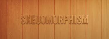
In the framework of digital interface design, this basically means making elements seem like real world objects. Wooden textures, torn paper and stitched ribbons are all examples of skeuomorphism in process and no doubt everyone has come over many more in current times.
There are combined feelings on the utilization of such elements however and arguments have been made in favor and against them. Even if you are not habituated with this concept, I’m firmly convinced that you deal with skeoumorphic design elements in day-to-day life. Have a look at your wardrobe. I bet you have some attire (pants, dresses, suits, jackets, whatever) with fake, decorative pockets. These are skeuomorphic pockets, as they simply replicate authentic, functional pockets. Another catchy recognized example is cigarettes. The paper around their filter is printed to look homogeneous to cork.
We have already presumed, skeuomorphism is a channel that makes design elements virtually 100% look similar to the objects from real life. Even a simple button with the marginal gradient in GU interface design is a skeuomorphic design element. All Apple’s interfaces are also skeuomorphic.
In UI and Web design, skeuomorphism endeavors to build three dimensional effects on a (flat) surface i.e. (2D). A skeuomorphic icon on a smartphone exhibit that serves the phone function, for example, is designed to look as much similar to a telephone (or handset) as is possible, typically with shadowing, highlights and some degree of detail. A button might pop up to be raised until clicked and then appears to lower as if it had been physically pressed.
Non-visual skeuomorphs involve the page-turning movement used to advance an eBook, the sound of a record ending at the terminus of a CD and the sound of a camera shutter on a digital camera.
Skeuomorphism is equally difficult to handle:
Skeuomorphic design are that skeuomorphic interface elements use metaphors that are more arduous to operate and take up more screen space than standard interface elements, that this breaks operating system interface design standards, that it causes an inconsistently erratic look and feel between applications, that skeuomorphic interface elements hardly incorporate numeric input or feedback for accurately setting a value, that many users may have no experience with the authentic device being imitated, that skeuomorphic design can increment intellectual load with visual noise that after a few uses gives little or no value to the utilizer, and that skeuomorphic design limits creativity by grounding the experience to physical counterparts.
Apple Inc., while under the guidance of Steve Jobs, was known for its wide utilization of skeuomorphic designs in different applications. The debate over the merits of Apple’s extensive utilization of skeuomorphism became the subject of significant media attention in October 2012, a year after Jobs’ death, largely as the result of the reported resignation of Scott Forstall, described as the most vocal and high-ranking proponent of the visual design style favored by Mr. Jobs. Apple designer Jonathan Ive, who surmounted some of Forstall’s responsibilities and had “made his distaste for the visual ornamentation in Apple’s mobile software known within the company”, was expected to move the company toward a less skeuomorphic aesthetic. With the declaration of iOS 7 at WWDC, Apple officially switched from skeuomorphism to a more easy design, thus introducing the so-called “death of skeuomorphism.
Flat web design and skeuomorphism are two design processes that could not be more dissimilar. Over the last few years skeuomorphism has been the chosen approach by the huge mass of web designers. This is largely due to the prosperity of Apple, and in particular, the iPhone.
For those of you old enough to remind when Chevy Chase was funny, circa 1981-89, you may recall his starring role as Clark Griswold in the film “National Lampoon’s Vacation” (1983). Well if you do, you may also recollect his car; a Wagon Queen Family Truckster. It was an incredibly unsightly station wagon with that awful simulated woodgrain panelling affect that consists of no authentic wood.
Skeuomorphism is ultimately a way to make something unknown feel familiar. It utilizes metaphor to communicate though pre-existing proficiency and is a natural first trial at designing in any advanced medium. It’s not anything brand new. Skeuomorphism has been part of design for several years.
As is eventually the case we gradually become comfortable in the new medium and whatever subsidiary information the skeuomorph communicated loses its meaning and usefulness.


Leave A Comment